 |
1- "Words and lettering played an enormous role in films of the silent era."
I found this part of the article interesting, due to the fact that I did not actually know that silent films had title sequences, and its interesting that it seems so minimalistic now, but back then, it probably would have been a huge thing. Also, the accompanied imagery, showing what they look like interested me, due to it being so different to how title sequences are executed now.
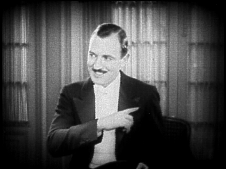 |
2 - "Ralph Spence was the highest-paid title writer in the industry, earning $10,000 a picture for his one-liners."
I also found this interesting, due to the amount that this man was paid to only generate humorous little jokes. Its also interesting as, at the moment in time, that amount of money would have been seen as a lot, whereas now, I do not think it would been viewed the same.

3 - "Allen uses the Windsor font for most of his films, as illustrated below in “Annie Hall” (1977)."
The reason why I found this section of the article interesting, was due to the fact that it states that Woody Allen usually tends to use the typography named Windsor. This made me think to what is the reason for using this font numerous of times in his films? What purpose does it have to keep using the same one? It also shows the difference over time, and how the title sequence has changed rapidly.

4 - "If there were a hall of fame for film title design, Stephen Frankfurt’s sequence for the 1962 film “To Kill A Mocking Bird” (below, upper row) would have a seat of honor."
I also found this statement to be interesting, due to the way in which they say that this film would be 'a seat of honor.' which shows that the writer highly values the work and effort done for this title sequence. It also makes me want to see what the fuss is all about, and to see if I would feel the same was as in which the writer feels about this sequence.
5 - "But the measure of a title design’s quality is the same now as it was in the silent era."
I found this quiet interesting, when the conclusion starts, as the writer still believes that the title sequences design quality, still remains the same as those of the silent era sequences. I think that title sequences have change quiet a lot, so seeing this shocked me a little. This also intrigued me, due to the writer sharing their feelings on how they perceive modern and olden title sequences, and viewing them as the same, whereas, I thought they have improved a lot.
No comments:
Post a Comment