Wednesday, 31 October 2012

The Art Of Film Title Design Throughout Cinema History


1- "Words and lettering played an enormous role in films of the silent era."

 I found this part of the article interesting, due to the fact that I did not actually know that silent films had title sequences, and its interesting that it seems so minimalistic now, but back then, it probably would have been a huge thing. Also, the accompanied imagery, showing what they look like interested      me, due to it being so different to how title sequences are executed now.
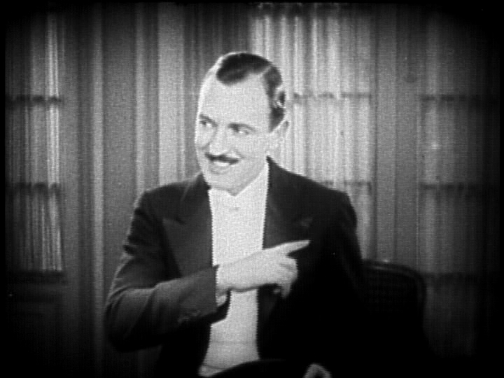


2 - "Ralph Spence was the highest-paid title writer in the industry, earning $10,000 a picture for his one-liners."

I also found this interesting, due to the amount that this man was paid to only generate humorous little jokes. Its also interesting as, at the moment in time, that amount of money would have been seen as a lot, whereas now, I do not think it would been viewed the same.


3 - "Allen uses the Windsor font for most of his films, as    illustrated below in “Annie Hall” (1977)."

The reason why I found this section of the article interesting, was due to the fact that it states that Woody Allen usually tends to use the typography named Windsor. This made me think to  what is the reason for using this font numerous of times in his films? What purpose does it have to keep using the same one? It also shows the difference over time, and how the title sequence has changed rapidly.


4 - "If there were a hall of fame for film title design, Stephen Frankfurt’s sequence for the 1962 film “To Kill A Mocking Bird” (below, upper row) would have a seat of honor."

I also found this statement to be interesting, due to the way in which they say that this film would be 'a seat of honor.' which shows that the writer highly values the work and effort done for this title sequence. It also makes me want to see what the fuss is all about, and to see if I would feel the same was as in which the writer feels about this sequence. 

5 - "But the measure of a title design’s quality is the same now as it was in the silent era."

I found this quiet interesting, when the conclusion starts, as the writer still believes that the title sequences design quality, still remains the same as those of the silent era sequences. I think that title sequences have change quiet a lot, so seeing this shocked me a little. This also intrigued me, due to the writer sharing their feelings on how they perceive modern and olden title sequences, and viewing them as the same, whereas, I thought they have improved a lot.


Fight Sequence

For the fight sequence, we had to film it just as a regular fight scene - including a different array of camera shots/angles. We had to film it in parts, then once it had been filmed, we had to edit the video together so it looked like a sequence. Kate and Lucy played the actress' (with some extras) and I filmed the video. We each took turns to edit it. 

After we edited it, we was told to add in Foley sound into certain parts in the sequence, such as the slapping moments and the other violent parts. We was given different objects to create the Foley sound. For example, we were given slabs of meat to make a deep slap noise, celery to create a bone creaking sound, a melon to also create a slapping sound, and many others. We all set out and used as many different objects we could. Once we finished, we then edited the sounds into the video, creating our fight sequence with Foley sound clip.

The original clip without Foley sound it the first video, and the second one is the clip with the Foley sound added too it.


This is the fight sequence without Foley sound.


This is the fight sequence with Foley sound.

Sunday, 28 October 2012

Halloween III: Season of the Witch Title Sequence


The title sequence or Halloween III: Season of the Witch reveals all the actors and important people involved with the film. It starts with creepy, slow and dramatic music, and with what seems to be a flickering screen - making it seem to be vintage.

The genre of the film, is constructed through the use of the music, the colours used in the sequence, and the imagery that is being shown. The music reveals the genre, due to the spookiness of it, and the way it comes across as almost chilling. Also, the colours used in the sequence are blacks and oranges. The colours black and orange, connote darkness and death, and is normally associated with Halloween, which is a scary day of the year. Also, the names of the people involved are in blue, which could suggest that there is some innocence remaining in the film, and its not completely evil. Finally, the imagery shown shows the genre, due to the use of the pumpkin, which again, is linked to Halloween time of the year.

The sequence starts with what appears to be an old fashioned television, flickering, as if it is being turned on. This could suggest that television may play an important part in the film, or have some significance. Also, it makes it creepy, due to the flickering screens and the music used in this particular part. It does not reveal too much about what will happen in the film, due to only showing orange lines which form a pumpkin. It shows nothing that happens in the film.

The genre of the music used in the sequence vegins as almsot sci-fi type music, but then changed into a low humming sound, which makes it come across as dark and mysterious. I think this type of music has been chosen, to add to the atmosphere of mystery and to make it seem more frightening, and to contribute to make the audience get in the mood for the film.

The way the sequence has been edited, reveals little sections of the image of a pumpkin at a time. This may have been done to hint at the fact that the film will be shown to reveal little parts of information at a time, and you will not know the full story until the very end of the film - as the entire pumpkin was only shown at the end of the film.

Also, the typography used in the sequence is bold and mostly in capitals. The colour of the font used, contrasts with the colour scheme of the sequence, as the sequence uses dark colours that connotes death and darkness, and the names of the people involved use dark blues, which changes into a light blue. The use of the dark blue, changing into a lighter blue, could be suggesting that someone or something maybe changing from evil too good, due to light blue connoting purity.

Overall, I think the title sequence is effective for the genre of the film, as it reveals hardly any details about the film itself, as it shows no scenes in the film, and it does not reveal the whole image of the pumpkin at one times. Also, the music makes the sequence more dramatic and frightening, as it is slow and the base is down low. Finally, the colours contribute to the film, as the film in named "Halloween" and the colours and the image of the pumpkin linked to the  day Halloween.

The Avengers Title Sequence


The title sequence for the film “The Avengers” shows the different superheroes that are going to feature in the film. It starts by revealing their attires and their iconic weapons.  The sequence also shows the actors names next to the attire they wear.

The genre of the film in constructed through the use of the characters clothes and weapons. The clothes shown resemble those of which superheroes wear, and the use of their weapons further suggests this. It has also been constructed through the use of the music, as the music is relatively upbeat, and like a heroic song as if something has been accomplished or discovered. 

The opening titles show some of the different characters that are going to feature in the film. It also reveals what weapon or accessory they hold, but instead of showing a full shot of them, it glimpses over the characters as if someone is gazing over them, placing the viewer in the position as if they are examining the characters. The fonts also move with the camera, which imitates the eyes of the viewer. It also creates narrative enigmas at this point, as you notice that they costume is as if they have been in a fight, as they are ripped scratched and partially ruined.  This suggests that they have been in a battle. The first sign of this is shown on Captain America’s shoulder, as it has a tear, and looks worn down, shown through use of close ups and extreme close ups.

The genre of the music used in The Avengers title sequence is instrumental, also called fanfare. Fanfare is usually associated with wartime, which involves violence and fighting. I think the filmmakers have decided to use this track to drawn more attention to what is being shown on the film, as it does not feature any lyrics. Also, it makes the film have a heroic/discovery element, as this type of music is usually associated with finding something important or when someone does something good. The effect of this music choice shows the film is going to involve action of some sort, and will feature heroic moments.

The sequence has been edited to show different sections of the different characters. The transitions used are relatively smooth when it changes to each character, as you hardly notice the change in shot until the costume is shown. Also the pace of the edit is slow/medium, as it gives the audience enough time to recognize the characters in the shot, but also does so in a timely manor, meaning it doesn’t spend too much time on each character. Judging by the sequence, the shot focuses on each character at a relatively same length as each other.

The typography used in the sequence looks like metal/armor. The use of the colour of the typography connotes heroic, purity and all that is good. It suggests that the characters in the shot are the good guys, and the heroes. The fonts used are relatively sharp looking, which further suggests the connotation of armor and the way it shines in the sequence further connotes this. The font hints at the genre of action. It also hints at a present setting, as the font looks modern and almost futuristic. Also, the font, such as action, fighting, protection and so on, can determine the themes off the film. The font shows this due to its colour and what it connotes.

As a whole, the title sequence suggests to me that the film will definitely involve action, fighting and maybe death. It also suggests that the characters in the sequence as the good guys, due to the music and the colour of their attires are relatively colourful and bright. The whole film connotes that there is obviously something extremely bad is going to happen, due to the fact that it requires more than one superhero to take them down, and it requires them to form a team.

Zombieland Title Sequence


The title sequence to the film Zombieland, shows miniature clips from the film. The clips used show graphic sections to the scene, and mainly show humans running away from blood-thirsty looking zombies.

Zombieland is about "A shy student trying to reach his family in Ohio, and a gun-toting tough guy trying to find the Last Twinkie and a pair of sisters trying to get to an amusement park join forces to travel across a zombie-filled America." - IMDb.com


The main colour used for the typography is red. This connotes death and danger, which is true to the film, as the film shows blood and gore throughout. Also, the typography in the title sequence is fixated to certain parts of the scenery in the shot. For example, at the start, the words "Columbia Pictures presents" is fixed to look like it is attached to the building  as it faces the same direction and slanted the same way as the building. Also, the typography moves as if it has been hit by something, which shows panic and as if someone has run into it due to rushing away from the zombies. 

The music used for the title sequence is what could be classed as heavy metal. The use of this type of music genre, adds to the fast pace of the characters. It also contrasts with the way it has been edited, as everything is in slow motion, yet the music makes it appear that the film should be fast paced. The music also connotes danger, as it is usually associated with scenes that have car chases or on foot chasing. It is also usually used in crime drama television shows - which involve death and violence. 

In each of the shots in the title sequence, there is some sort of blood. Also, there is normally a character running away from a zombie, with panic and fear on their faces. By the scenery  you can tell that the film is set in a town/city location, due to the amount of shops and people. By the apparel, you can also tell that it is set in present times. Also, each location in the title sequence, has either violence or someone about to die. Just by the first scene, you can tell the film will involve death, as someone is falling to their definite death. The scene after confirms the fact that the film involves death and violence, due to the way the may is spitting up blood, and the cuts and bruises on his face.

By making the entire sequence feature in slow motion, emphasizes each scene, and draws more attention to the detail trying to be communicated. For example, instead of having each scene fast paced, which is what I expected, it allows the audience to view the scenes for longer periods of time, and allows them to look around the scene more and absorb more of what is going on in the film. The use of the slow motion, also contrasts with the film itself, as the characters are clearly in a rush to get away from the zombies, but the editing makes it appear as if they are not moving. It could also connote that the humans do not stand a chance against the zombies, due to the fact that the slow motion could represent them not escaping in time.

The camera angles are mostly close-ups or wide shots. The use of these two camera angles, allow the audience to see what is being shown in the sequence. The close-ups show more details and emotions on the characters face, and allow the viewer to understand the kind of situation they are in at that moment in time. Also, the use of wide shots also allow the audience to see more of what is happening in the shot, and in some cases, allows them to see things that the characters might not be able to see (if they are turned away).

Overall, the title sequence as a whole, communicates the fact that the human population is in trouble by a zombie attack. It also reveals that the film will involve lots of gore and bloody scenes, and involve death and comedic moments, as the bridge tries to kill the husband.

Thursday, 25 October 2012

Continuity Sequence


Continuity Sequence

What went well

These are the things that I thought went well, such as: I think as a whole, we worked well as a group. We all helped by sharing our ideas, contributing while filming by creating dialogue, the acting and doing camera work and as a whole, got on well. I also thought that the way the sequence came together was good, as I thought it would appear to be too jumpy. The actress' worked well together as well, making the video seem more realistic, and not revealing too much about what is about to happen in the video.

What could have been improved

There were some parts of the video that could have been improved, such as: even though the video as a whole was good, there were a few minor jumpy sections. For example, when Kate sits down, the camera paused, and moved a little, then resumed to the same places. This did not need to happen, and the camera could have stayed in the same position. 


What I have learnt

I have learnt that, I should leave a few seconds before stopping the recording to allow space to cut the ending off, as it could cut some of the dialogue if its cut too quickly. Also, I have learnt how to work final cut pro, and how to use the basic editing features like cropping parts off a video clip. Finally, I also learnt how to film certain camera angles, and to follow the 180 degree rule.