
Wednesday, 7 November 2012

Friday, 2 November 2012
Thursday, 1 November 2012
Saul Bass
Saul Bass was a graphic designer, which lead to him becoming a filmmaker. He was born on May the 8th in 1920, and passed away on the 25th of April 1996. He is best known for his film poster designs and his title sequences in numerous of films.
 He worked with the likes of Alfred Hitchcock, Otto Preminger, Martin Scorsese and many others. One of his most famous title sequences was in the film "The Man with the Golden Arm" and in "North by Northwest". He was known for his use of colourful, simplistic, geometric shapes, which created imagery that involved the film. He revolutionized the way in which title sequences were made, and people still take influence from his
work today.

He did not just only do title sequences, he was also known for designing corporate logos, such as the AT&T bell, and the AT&T globe logos.
Saul Bass studied part-time in Manhattan at Art Students League, until he begun night classes with Gyorgy Kepes at Brooklyn College. He first started working at Hollywood by doing print work for film adverts. He then was spotted by Otto Preminger to design a film poster for Carmen Jones. They were so impressed with what Bass did, that he was then asked to do the title sequence. He used this opportunity to create a unique title sequence, as he wanted to achieve the mood and theme of the film, just by the opening sequence. He did not follow the normal title sequence, where they only showed the name of film, actors and such, but instead, presented them in a special way, with unique designs like his film posters.
 He worked with the likes of Alfred Hitchcock, Otto Preminger, Martin Scorsese and many others. One of his most famous title sequences was in the film "The Man with the Golden Arm" and in "North by Northwest". He was known for his use of colourful, simplistic, geometric shapes, which created imagery that involved the film. He revolutionized the way in which title sequences were made, and people still take influence from his
 work today.

He did not just only do title sequences, he was also known for designing corporate logos, such as the AT&T bell, and the AT&T globe logos.
Saul Bass studied part-time in Manhattan at Art Students League, until he begun night classes with Gyorgy Kepes at Brooklyn College. He first started working at Hollywood by doing print work for film adverts. He then was spotted by Otto Preminger to design a film poster for Carmen Jones. They were so impressed with what Bass did, that he was then asked to do the title sequence. He used this opportunity to create a unique title sequence, as he wanted to achieve the mood and theme of the film, just by the opening sequence. He did not follow the normal title sequence, where they only showed the name of film, actors and such, but instead, presented them in a special way, with unique designs like his film posters.
Wednesday, 31 October 2012
The Art Of Film Title Design Throughout Cinema History
 |
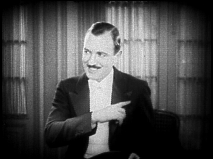
1- "Words and lettering played an enormous role in films of the silent era."
I found this part of the article interesting, due to the fact that I did not actually know that silent films had title sequences, and its interesting that it seems so minimalistic now, but back then, it probably would have been a huge thing. Also, the accompanied imagery, showing what they look like interested me, due to it being so different to how title sequences are executed now.
 |
2 - "Ralph Spence was the highest-paid title writer in the industry, earning $10,000 a picture for his one-liners."
I also found this interesting, due to the amount that this man was paid to only generate humorous little jokes. Its also interesting as, at the moment in time, that amount of money would have been seen as a lot, whereas now, I do not think it would been viewed the same.

3 - "Allen uses the Windsor font for most of his films, as illustrated below in “Annie Hall” (1977)."
The reason why I found this section of the article interesting, was due to the fact that it states that Woody Allen usually tends to use the typography named Windsor. This made me think to what is the reason for using this font numerous of times in his films? What purpose does it have to keep using the same one? It also shows the difference over time, and how the title sequence has changed rapidly.

4 - "If there were a hall of fame for film title design, Stephen Frankfurt’s sequence for the 1962 film “To Kill A Mocking Bird” (below, upper row) would have a seat of honor."
I also found this statement to be interesting, due to the way in which they say that this film would be 'a seat of honor.' which shows that the writer highly values the work and effort done for this title sequence. It also makes me want to see what the fuss is all about, and to see if I would feel the same was as in which the writer feels about this sequence.
5 - "But the measure of a title design’s quality is the same now as it was in the silent era."
I found this quiet interesting, when the conclusion starts, as the writer still believes that the title sequences design quality, still remains the same as those of the silent era sequences. I think that title sequences have change quiet a lot, so seeing this shocked me a little. This also intrigued me, due to the writer sharing their feelings on how they perceive modern and olden title sequences, and viewing them as the same, whereas, I thought they have improved a lot.
Fight Sequence
After we edited it, we was told to add in Foley sound into certain parts in the sequence, such as the slapping moments and the other violent parts. We was given different objects to create the Foley sound. For example, we were given slabs of meat to make a deep slap noise, celery to create a bone creaking sound, a melon to also create a slapping sound, and many others. We all set out and used as many different objects we could. Once we finished, we then edited the sounds into the video, creating our fight sequence with Foley sound clip.
The original clip without Foley sound it the first video, and the second one is the clip with the Foley sound added too it.
This is the fight sequence without Foley sound.
This is the fight sequence with Foley sound.
Sunday, 28 October 2012
Halloween III: Season of the Witch Title Sequence
The title sequence or Halloween III: Season of the Witch reveals all the actors and important people involved with the film. It starts with creepy, slow and dramatic music, and with what seems to be a flickering screen - making it seem to be vintage.
The sequence starts with what appears to be an old fashioned television, flickering, as if it is being turned on. This could suggest that television may play an important part in the film, or have some significance. Also, it makes it creepy, due to the flickering screens and the music used in this particular part. It does not reveal too much about what will happen in the film, due to only showing orange lines which form a pumpkin. It shows nothing that happens in the film.
The way the sequence has been edited, reveals little sections of the image of a pumpkin at a time. This may have been done to hint at the fact that the film will be shown to reveal little parts of information at a time, and you will not know the full story until the very end of the film - as the entire pumpkin was only shown at the end of the film.
Also, the typography used in the sequence is bold and mostly in capitals. The colour of the font used, contrasts with the colour scheme of the sequence, as the sequence uses dark colours that connotes death and darkness, and the names of the people involved use dark blues, which changes into a light blue. The use of the dark blue, changing into a lighter blue, could be suggesting that someone or something maybe changing from evil too good, due to light blue connoting purity.
Overall, I think the title sequence is effective for the genre of the film, as it reveals hardly any details about the film itself, as it shows no scenes in the film, and it does not reveal the whole image of the pumpkin at one times. Also, the music makes the sequence more dramatic and frightening, as it is slow and the base is down low. Finally, the colours contribute to the film, as the film in named "Halloween" and the colours and the image of the pumpkin linked to the day Halloween.
The Avengers Title Sequence
The title sequence for the film “The Avengers” shows the different superheroes that are going to feature in the film. It starts by revealing their attires and their iconic weapons. The sequence also shows the actors names next to the attire they wear.
The genre of the
film in constructed through the use of the characters clothes and weapons. The
clothes shown resemble those of which superheroes wear, and the use of their
weapons further suggests this. It has also been
constructed through the use of the music, as the music is relatively upbeat,
and like a heroic song as if something has been accomplished or discovered.
The opening titles
show some of the different characters that are going to feature in the film. It
also reveals what weapon or accessory they hold, but instead of showing a full
shot of them, it glimpses over the characters as if someone is gazing over
them, placing the viewer in the position as if they are examining the
characters. The fonts also move with the camera, which imitates the eyes of the
viewer. It also creates narrative enigmas at this point, as you notice that
they costume is as if they have been in a fight, as they are ripped scratched
and partially ruined. This suggests that
they have been in a battle. The first sign of this is shown on Captain
America’s shoulder, as it has a tear, and looks worn down, shown through use of
close ups and extreme close ups.
The genre of the
music used in The Avengers title sequence is instrumental, also called fanfare. Fanfare is usually associated with wartime, which involves violence and fighting. I think the filmmakers
have decided to use this track to drawn more attention to what is being shown
on the film, as it does not feature any lyrics. Also, it makes the film have a
heroic/discovery element, as this type of music is usually associated with
finding something important or when someone does something good. The effect of
this music choice shows the film is going to involve action of some sort, and
will feature heroic moments.
The sequence has
been edited to show different sections of the different characters. The
transitions used are relatively smooth when it changes to each character, as
you hardly notice the change in shot until the costume is shown. Also the pace
of the edit is slow/medium, as it gives the audience enough time to recognize
the characters in the shot, but also does so in a timely manor, meaning it
doesn’t spend too much time on each character. Judging by the sequence, the
shot focuses on each character at a relatively same length as each other.
The typography
used in the sequence looks like metal/armor. The use of the colour of the
typography connotes heroic, purity and all that is good. It suggests that the
characters in the shot are the good guys, and the heroes. The fonts used are
relatively sharp looking, which further suggests the connotation of armor and the
way it shines in the sequence further connotes this. The font hints at the
genre of action. It also hints at a present setting, as the font looks modern
and almost futuristic. Also, the font, such as action, fighting, protection and
so on, can determine the themes off the film. The font shows this due to its
colour and what it connotes.
As a whole, the
title sequence suggests to me that the film will definitely involve action,
fighting and maybe death. It also suggests that the characters in the sequence
as the good guys, due to the music and the colour of their attires are relatively
colourful and bright. The whole film connotes that there is obviously something
extremely bad is going to happen, due to the fact that it requires more than
one superhero to take them down, and it requires them to form a team.
Subscribe to:
Posts (Atom)